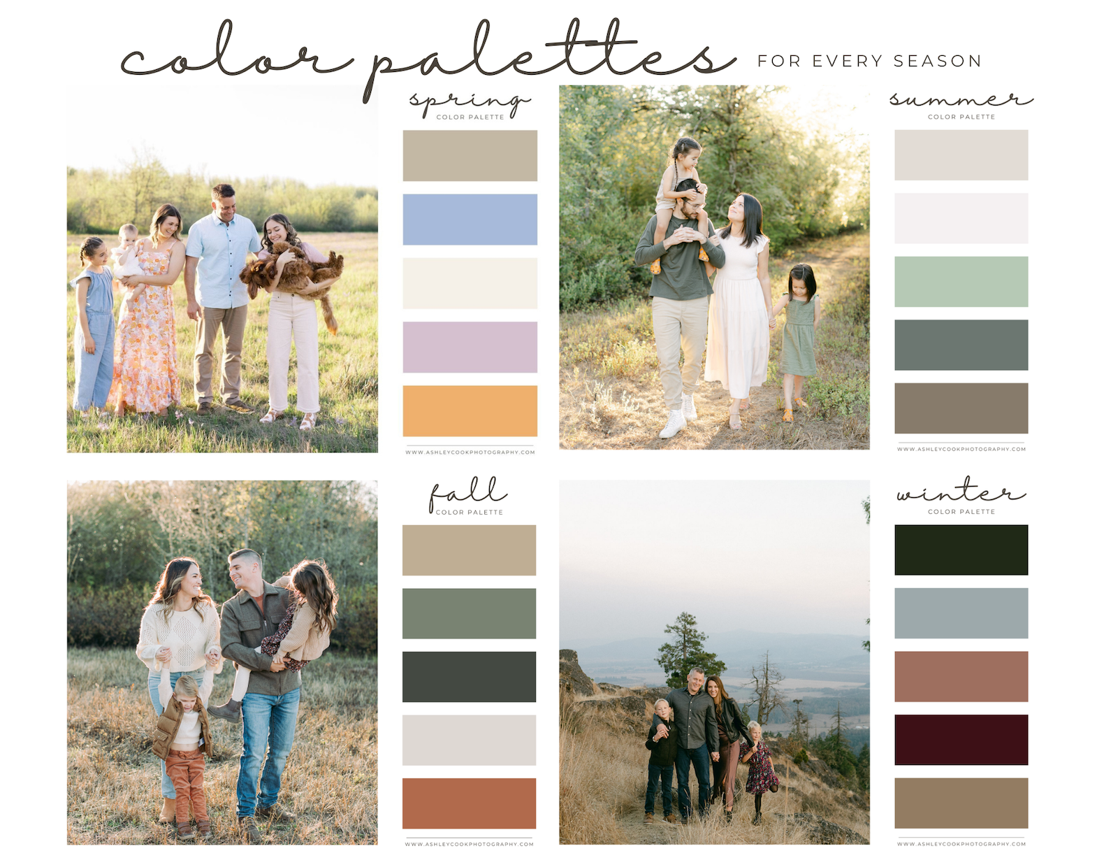
Family Photo Color Schemes for Spring, Summer, Fall & Winter
Choosing what to wear for family photos can feel overwhelming, especially when you are coordinating multiple outfits, personalities, and seasons. The easiest way to create a cohesive and timeless look is to begin with a thoughtfully chosen color palette.
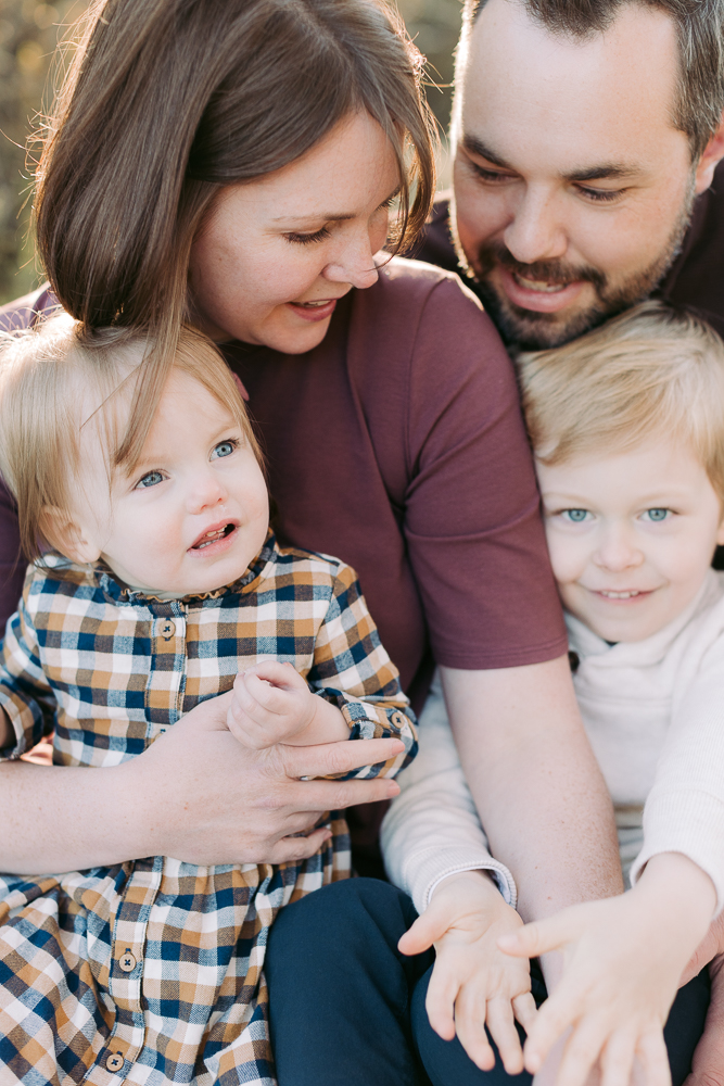
As a Eugene family photographer, I photograph families all year long. From soft spring blooms at Dorris Ranch, to golden summer evenings along the Oregon coast, to rich fall tones at Mt. Pisgah, and cozy winter sessions on tree farms, every season brings its own beautiful color inspiration.
This guide will walk you through the best family photo color schemes for spring, summer, fall, and winter so that no matter when your session takes place, you can confidently plan outfits that feel natural, elevated, and beautifully coordinated.
Instead of matching exactly, we will focus on color combinations that photograph beautifully in Oregon’s landscapes. Soft pastels in spring, airy neutrals in summer, warm earth tones in fall, and layered cozy tones in winter all create depth and visual interest in your images.
Bookmark this guide for later or scroll to your season below to start planning your family picture color schemes.
Choose Your Season
Planning ahead? Click below to jump straight to your season and find the perfect family photo color scheme.
Spring Family Pictures Color Scheme Ideas
Spring is one of the most popular times of year for family sessions in Oregon. Between blooming trees, fresh green grass, and soft golden light, spring family pictures have a naturally airy and romantic feel. Choosing the right spring family pictures color scheme helps your outfits complement the landscape instead of competing with it.
When planning what to wear for spring family photos, think soft, light, and slightly muted tones. Oregon’s spring scenery already brings a lot of color, so your outfits should feel cohesive without being overly bright.
Instead of matching everyone in the same shade, choose one anchor color and build around it with complementary tones and neutrals. Not everyone needs to wear every single color in the palette. Think of the color scheme as a shared guide rather than a strict formula. Each family member can choose one or two tones from the palette, and together the overall look will feel cohesive without looking overly styled or forced.
Here are some beautiful spring family photo color palettes that photograph especially well in Eugene and surrounding areas.

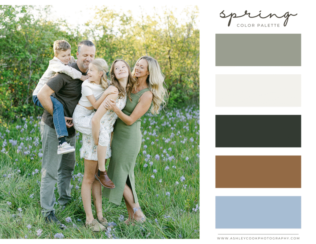
Think of your color palette as a menu. Everyone can order something different, but it all belongs to the same collection.
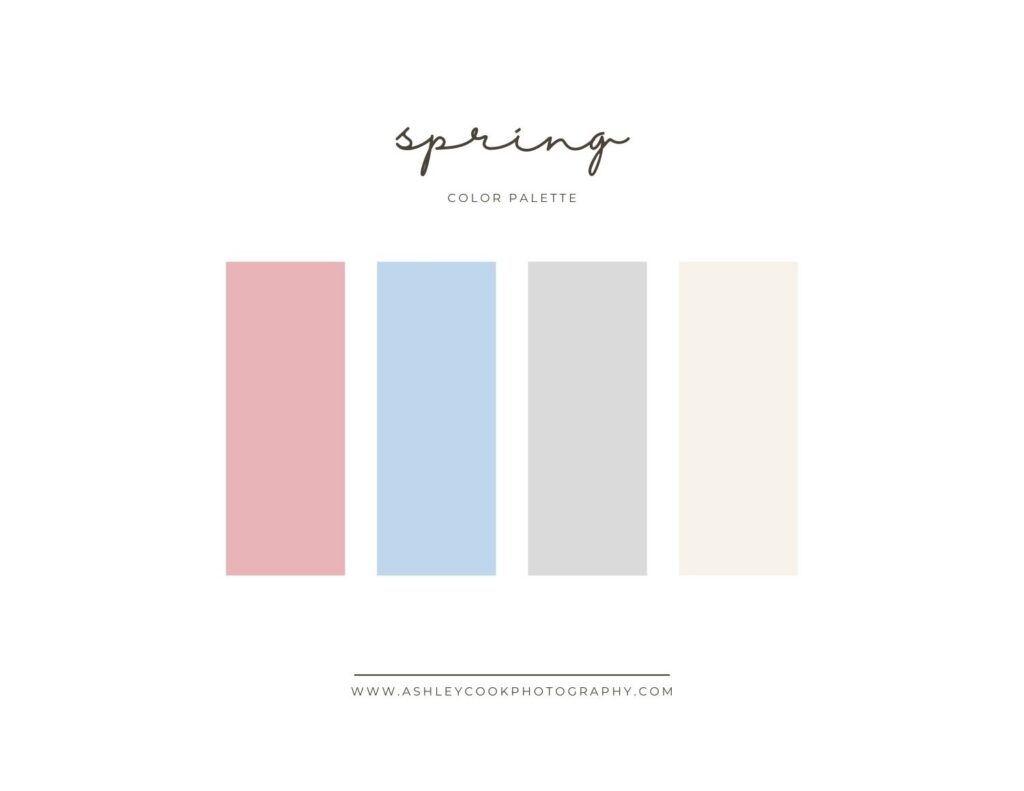
Palette 1: Soft Garden
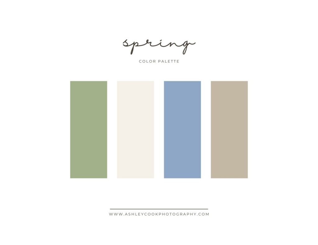
Perfect for Dorris Ranch, open fields, or blooming orchards.
- Sage green
- Cream or soft ivory
- Dusty blue
- Warm taupe
Why it works: Sage and dusty blue echo the fresh greens of spring while cream keeps the overall look light and timeless. This spring family pictures color scheme feels natural and elegant without being trendy.
Palette 2: Blush & Sky
Beautiful for golden hour sessions and light-filled evenings.
- Blush
- Soft sky blue
- Light gray
- Ivory
Why it works: Blush adds warmth without overpowering the image, while soft blue balances the palette. This is a flattering spring family photo outfit combination for moms who want something feminine but subtle.
Palette 3: Lavender & Sage
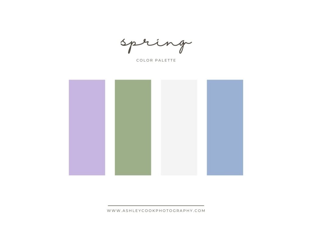
A slightly more playful spring option.
- Lavender
- Muted sage
- Soft white
- Pale denim
Why it works: Lavender pairs beautifully with Oregon’s soft spring greens. When styled in flowing fabrics or light knits, this spring family pictures color scheme feels fresh and effortless.moms who want something feminine but subtle.
What to Avoid for Spring Family Pictures
- Neon brights that clash with natural greenery
- Heavy black outfits that feel too dark for the season
- Large logos or bold graphic prints
- Everyone wearing the exact same color
Spring is about softness and movement. Light layers, textured fabrics, and slightly muted tones will always photograph better than high-saturation colors.

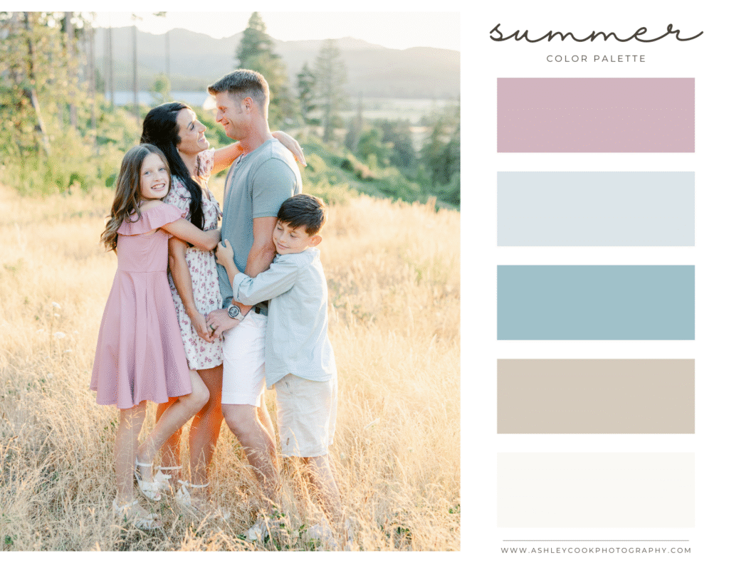
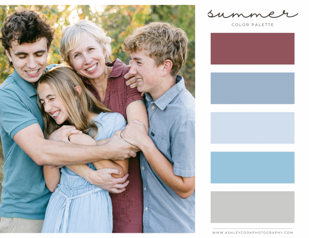
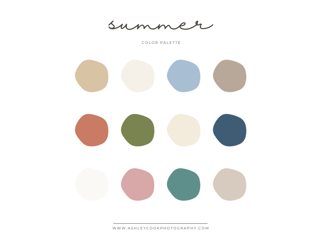
Summer Family Pictures Color Schemes
Summer family pictures in Oregon have a completely different feel than spring. The grass turns golden, the evenings feel warm and glowy, and coastal sessions bring in soft blues and sandy neutrals. Choosing the right summer family pictures color scheme helps your outfits complement the warmth of the season rather than overpower it.
When deciding what to wear for summer family photos, think light, breathable fabrics and sun-washed tones. Summer light is stronger and more direct than spring, so overly bright colors can feel harsh in photos. Softer neutrals and earthy tones tend to photograph beautifully during golden hour.
Just like in spring, not everyone needs to wear every color in the palette. Choose a few tones that work well together and let each family member pick one or two that feel comfortable and natural.
Here are some beautiful summer family photo color palettes that work especially well in Eugene, Central Oregon, and along the coast.
Palette 1: Coastal Neutrals
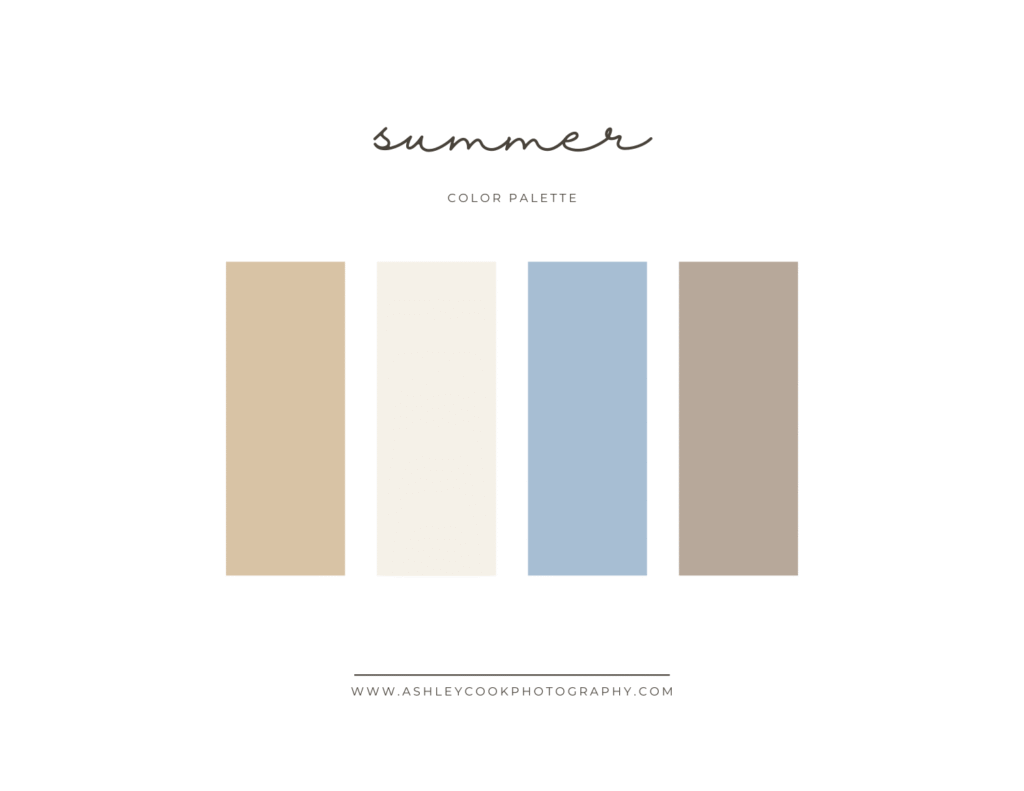
Perfect for beach sessions at Heceta Head or breezy evening sessions near water.
- Sand
- Cream
- Soft blue
- Driftwood beige
Why it works: These tones mirror the beach itself. Cream and sand keep the look light, while soft blue adds just enough contrast without feeling bold. This summer family pictures color scheme feels timeless and relaxed.
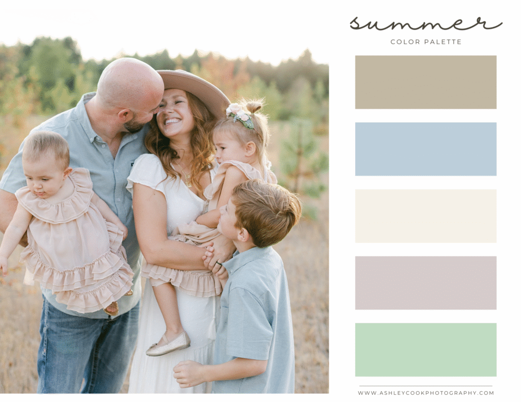
Palette 2: Earthy Summer
Beautiful for golden fields, open meadows, and sunset sessions.
- Terracotta
- Olive
- Warm cream
- Classic denim
Why it works: Terracotta adds warmth that complements Oregon’s dry summer grasses, while olive keeps everything grounded. Denim works as a neutral here and photographs especially well in casual summer family photo outfits.

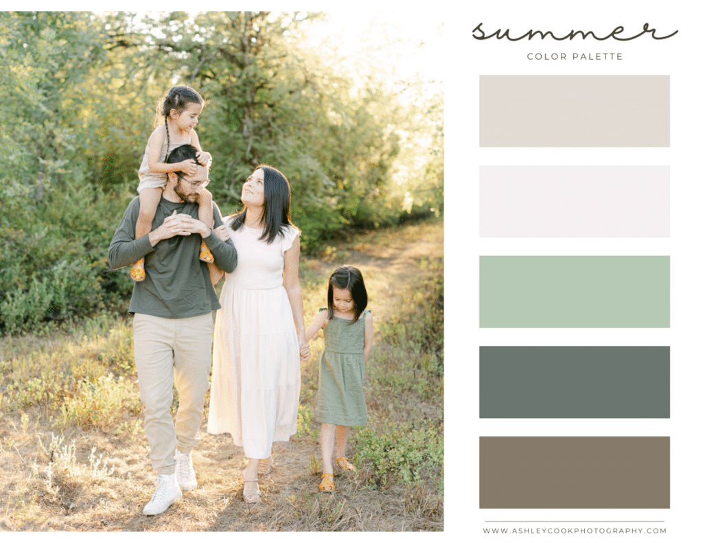
Palette 3: Light & Airy
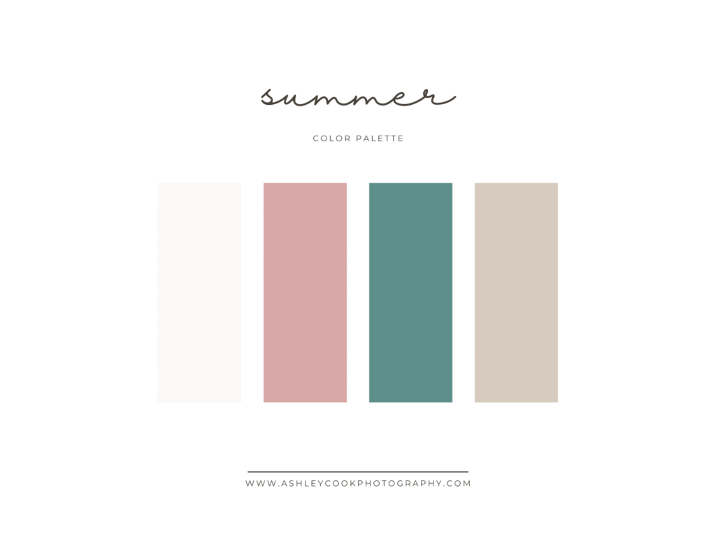
Great for backyard sessions or bright, open locations.
- Soft white
- Dusty rose
- Muted teal
- Light khaki
Why it works: This palette keeps things fresh without leaning too bold. Dusty rose adds softness, and muted teal provides a subtle pop that still feels elevated.
What to Avoid for Summer Family Pictures
- Bright primary colors like fire-engine red or royal blue
- Heavy dark fabrics that feel too wintery
- Matching denim on everyone
- Neon tones that reflect harshly in direct sunlight
Summer is about warmth, movement, and ease. Flowy dresses, rolled sleeves, linen textures, and breathable layers always photograph beautifully in the evening light.
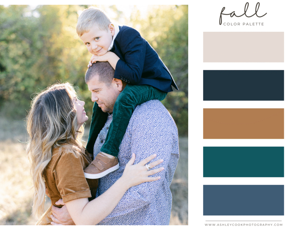
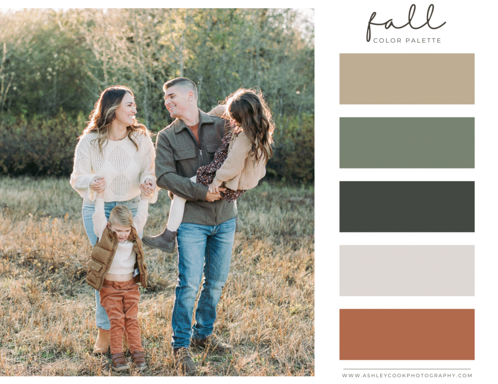
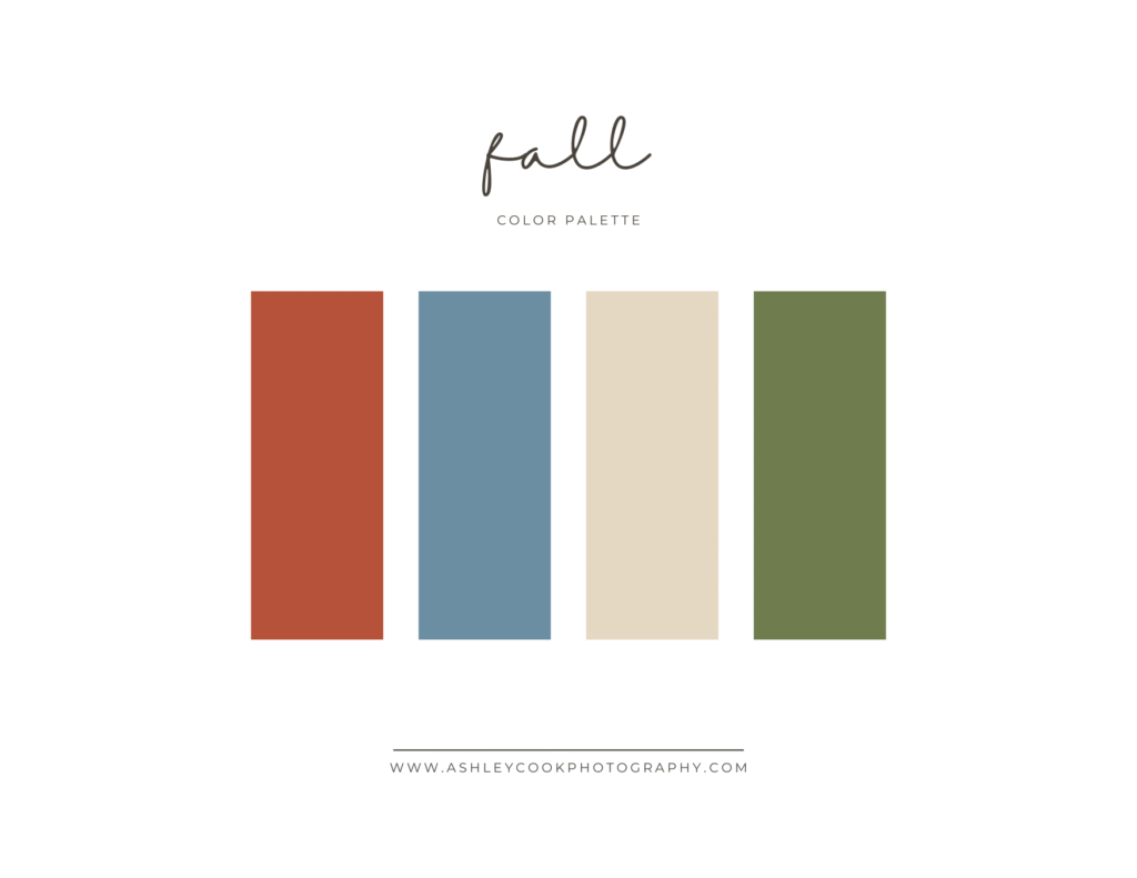
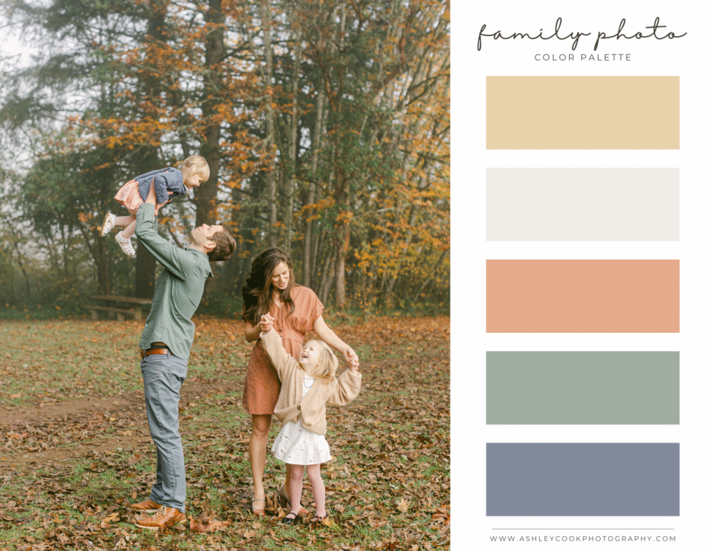
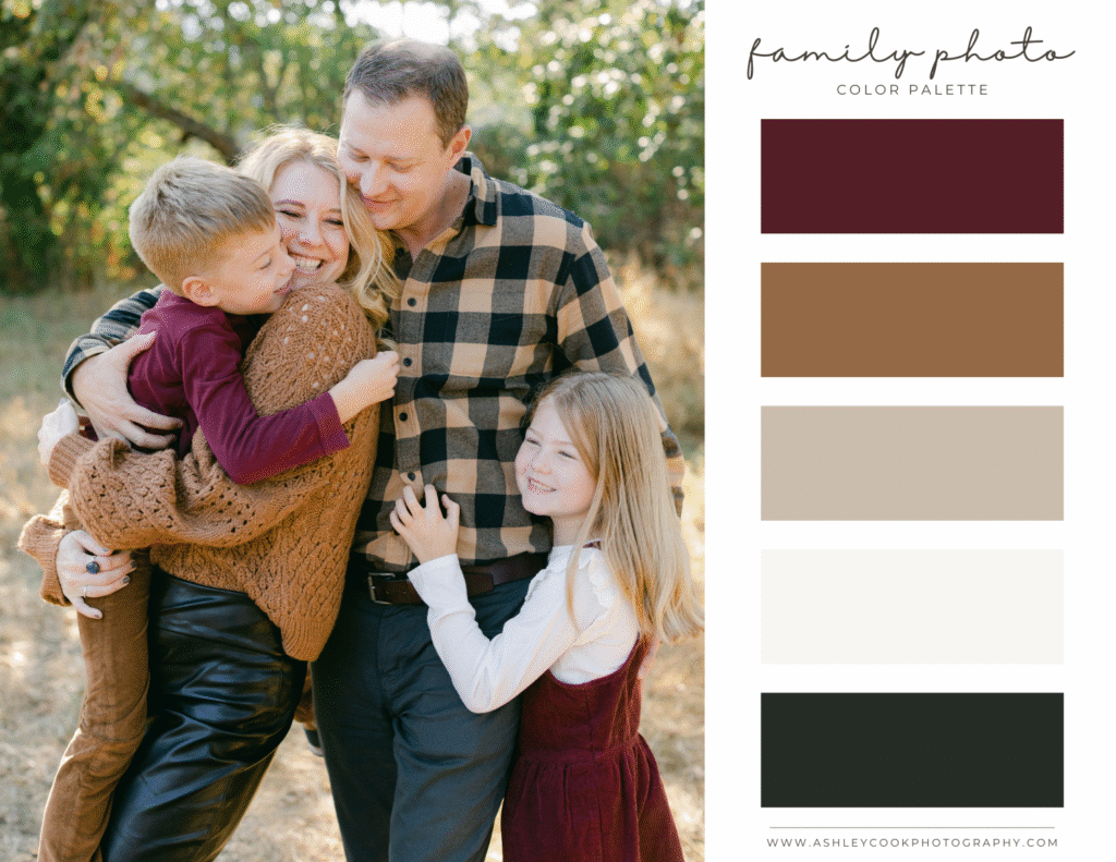
Fall Family Picture Outfit Color Ideas
Fall family pictures are consistently the most requested sessions of the year. In Oregon, the changing leaves, golden fields, and rich forest tones create the perfect backdrop for warm, layered outfits. Choosing the right fall family pictures color scheme helps your photos feel timeless instead of overly trendy.
When planning fall family picture outfits, think depth and contrast. Fall naturally brings richer tones into the landscape, so this is the season where you can lean into color a bit more while still keeping things balanced.
As always, everyone does not need to wear every color in the palette. Choose one anchor tone and build around it with complementary shades and neutrals. When each family member wears one or two tones from the same color family, the overall look feels cohesive and effortless.
Fall color schemes photograph especially beautifully at local Eugene spots like Dorris Ranch, Spencers Butte, and Mt. Pisgah when the leaves begin to shift.
Here are some fall family photo color palettes that work beautifully in the Pacific Northwest.
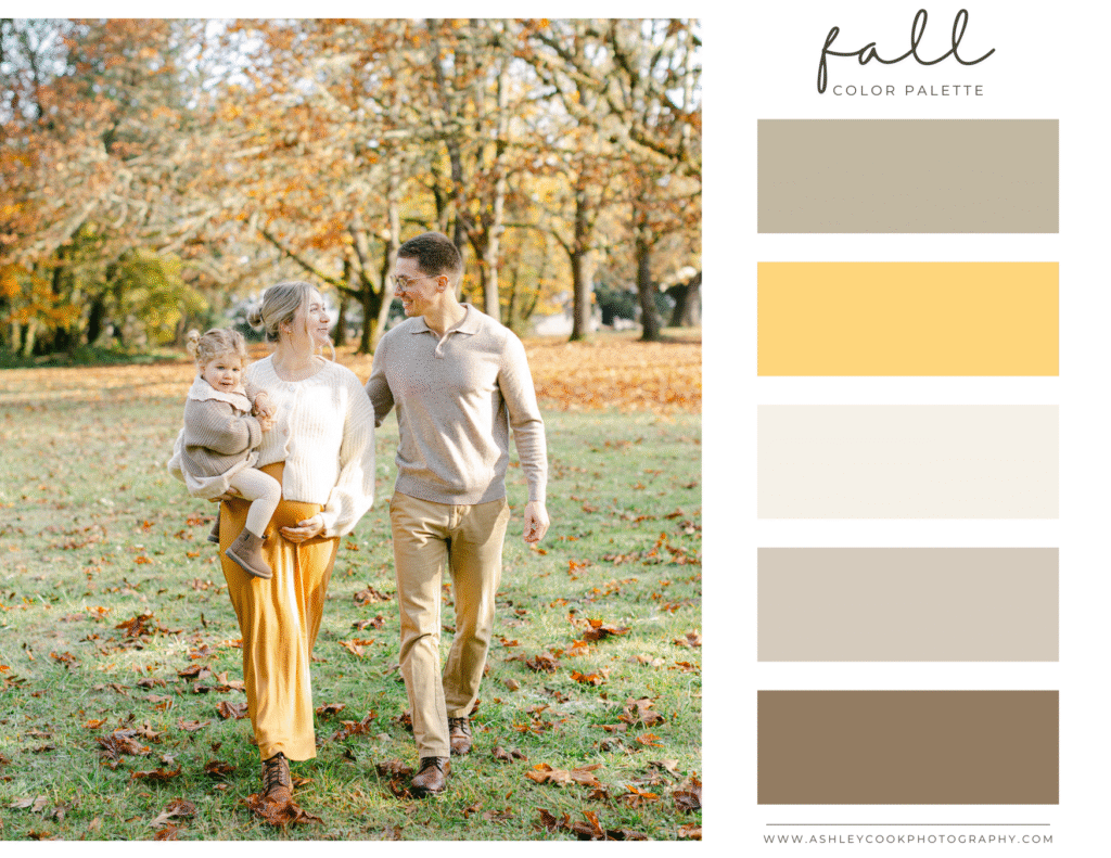

Palette 1: Classic Autumn
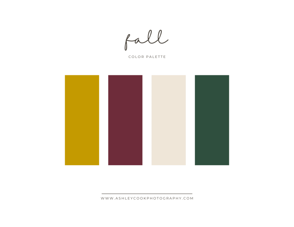
Perfect for orchard sessions or wooded trails.
- Mustard
- Deep burgundy
- Cream
- Forest green
Why it works: Mustard and burgundy bring warmth, while cream softens the overall look. Forest green ties everything back to the surrounding trees. This fall family pictures color scheme feels rich without feeling heavy.
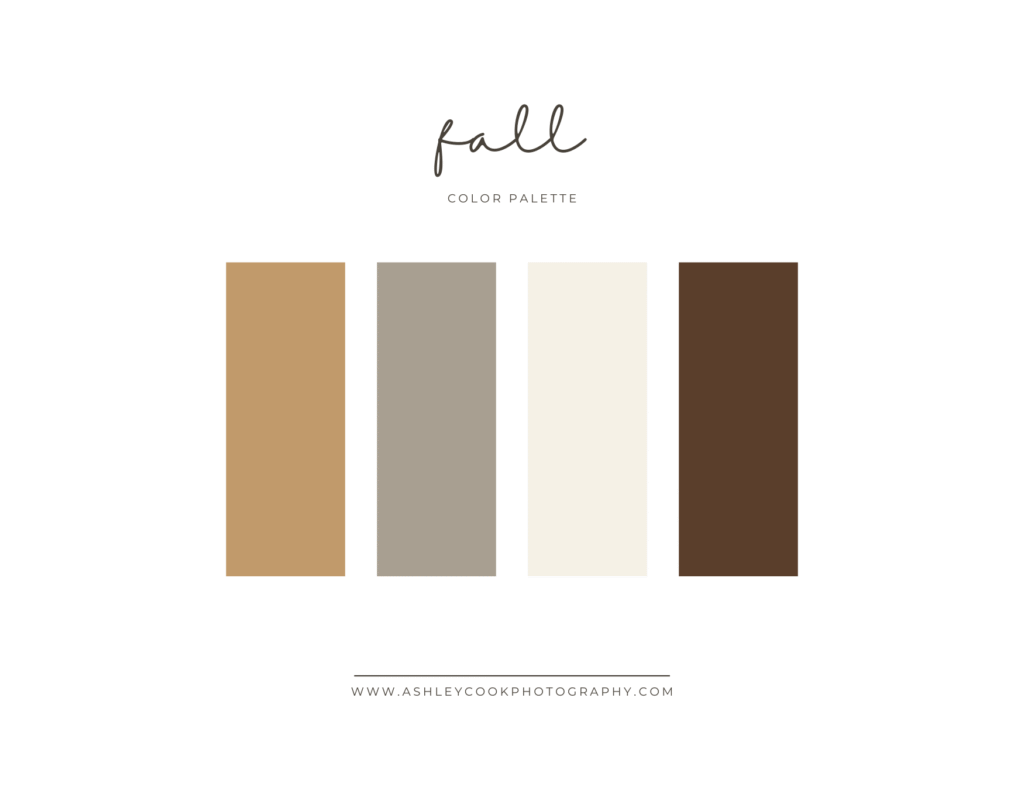
Palette 2: Neutral Fall
Ideal for families who want something softer and more editorial.
- Camel
- Warm gray
- Ivory
- Chocolate brown
Why it works: This palette feels elevated and timeless. Camel and brown add warmth, while ivory keeps the outfits from feeling too dark. It photographs beautifully during overcast Oregon fall days.
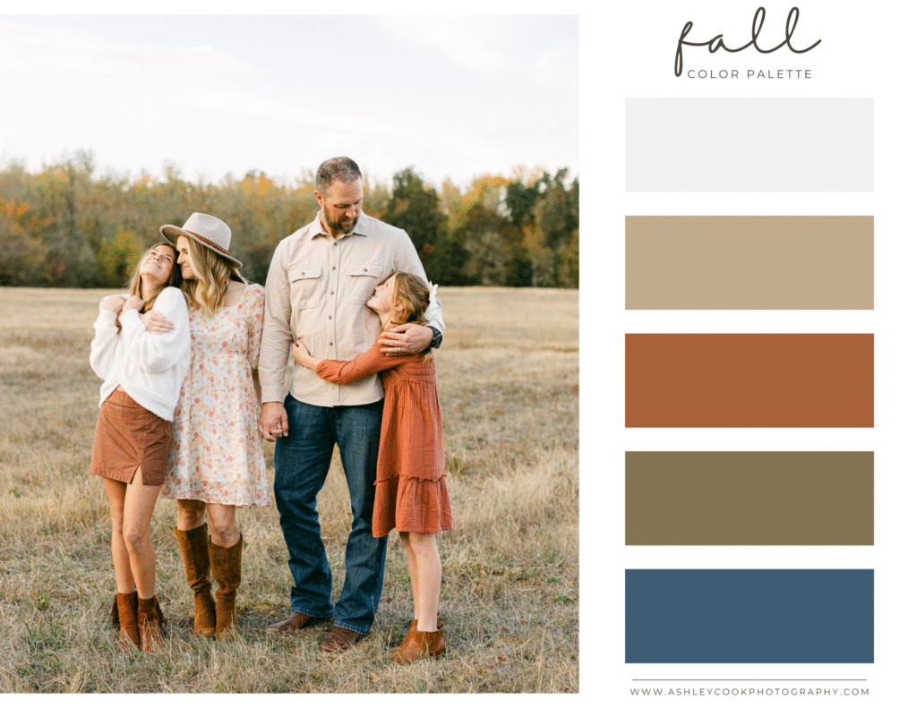
Palette 3: Soft Rustic
A balanced option with subtle contrast.
- Rust
- Dusty blue
- Oatmeal
- Olive
Why it works: Rust complements fall foliage, while dusty blue adds a soft contrast that keeps the palette interesting. Oatmeal and olive ground the look and prevent it from feeling too bold.
What to Avoid for Fall Family Pictures
- Everyone in jeans and black tops
- Overly bright orange that competes with foliage
- Too many dark tones without a lighter neutral to balance
- Busy plaids layered on multiple people
Fall is the perfect season for texture. Sweaters, layered cardigans, structured jackets, boots, and cozy knits photograph beautifully and add depth to your images without overwhelming the frame.

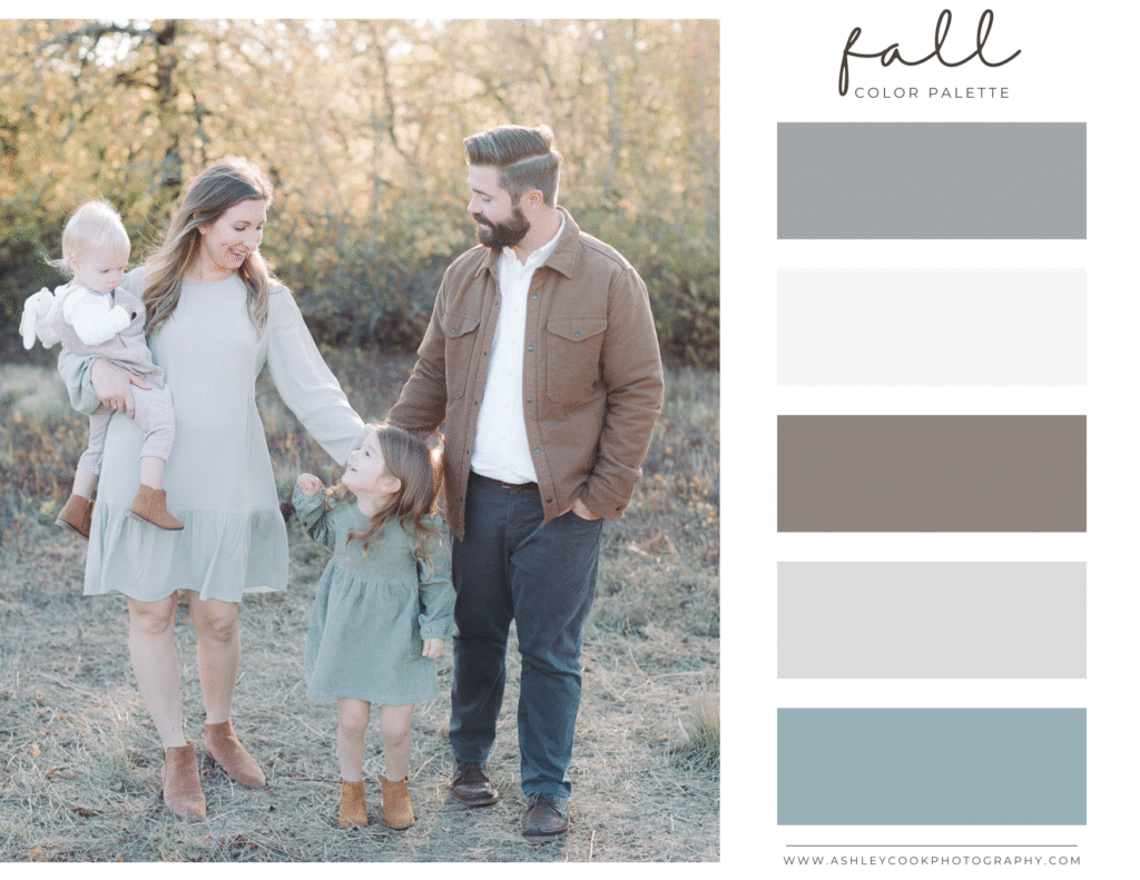
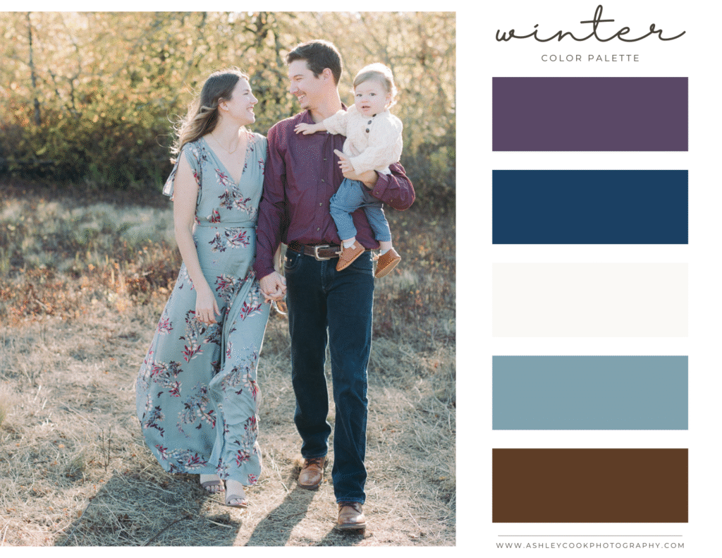
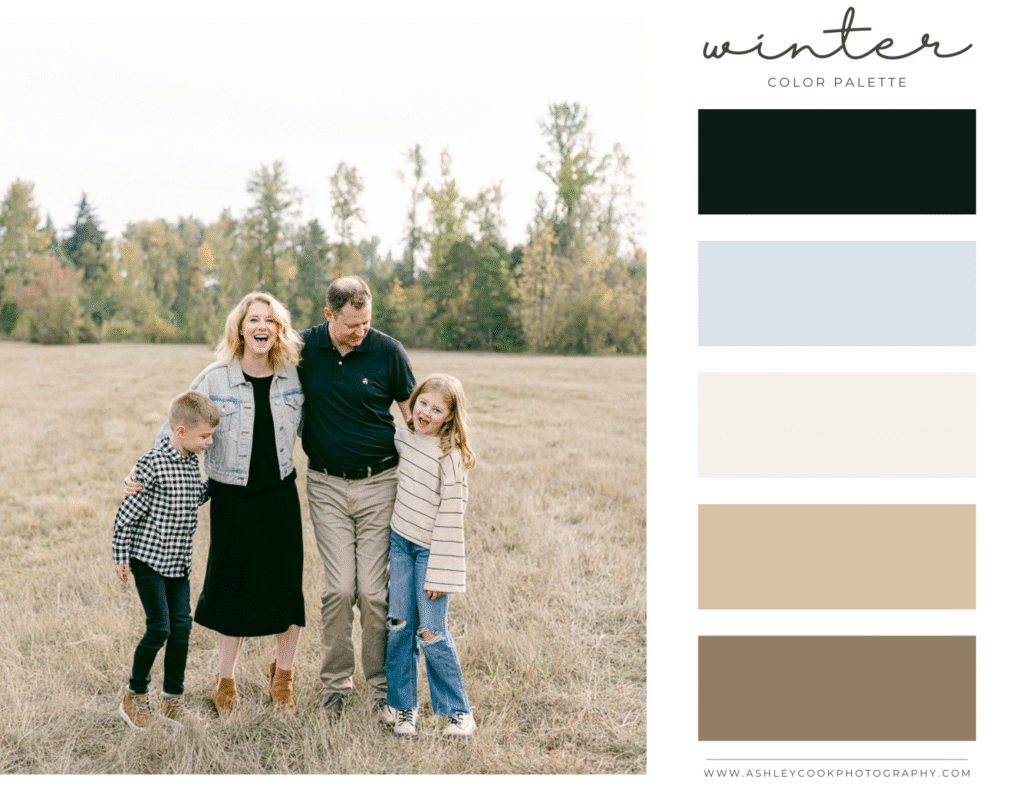
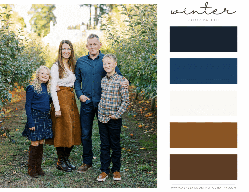
Winter Family Photo Color Palettes
Winter family pictures have a completely different feel than any other season. The trees are bare, the light is softer, and outfits naturally include more layers and texture. Choosing the right winter family photo color palette helps your images feel warm and inviting even on cooler Oregon days.
When deciding what to wear for winter family photos, think cozy, layered, and intentional. This is the perfect season for coats, scarves, knits, structured jackets, and boots. Because the landscape is often more neutral, your color choices become even more important.
As with every season, not everyone needs to wear every color in the palette. Choose a shared color direction and let each family member select one or two tones within that range. The goal is coordinated, not identical.
Winter sessions photograph beautifully at tree farms, open fields, or even forested areas around Eugene where evergreen trees add depth and contrast.
Here are some winter family photo color palettes that feel timeless and elevated.
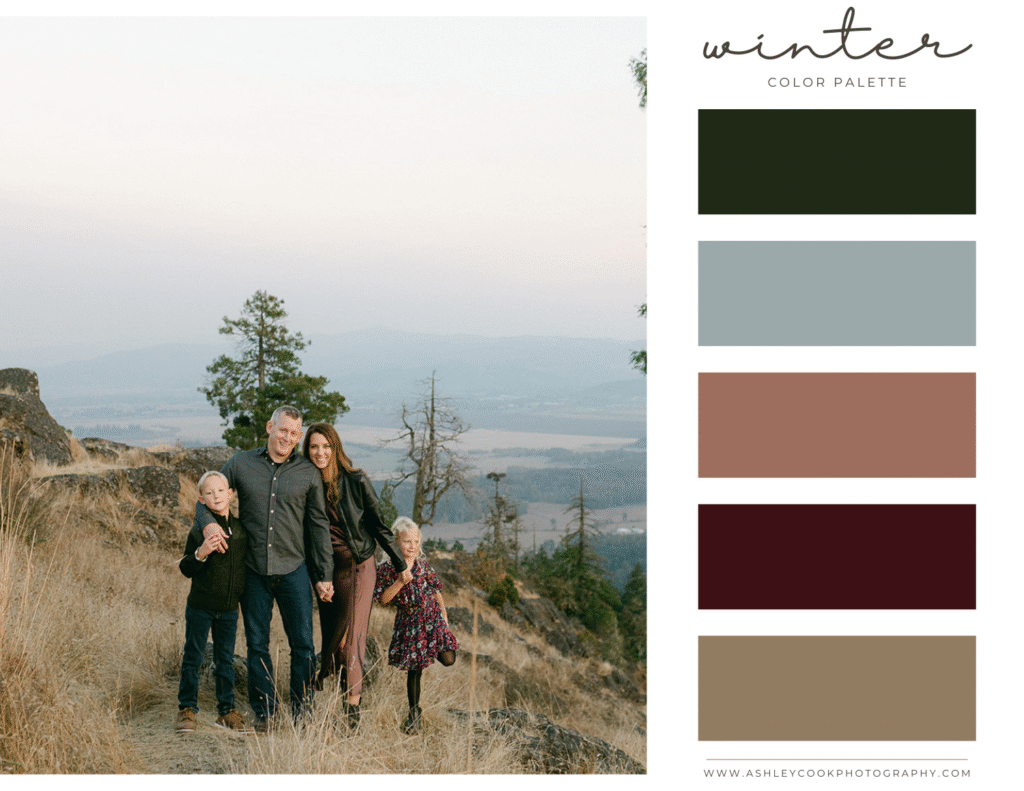
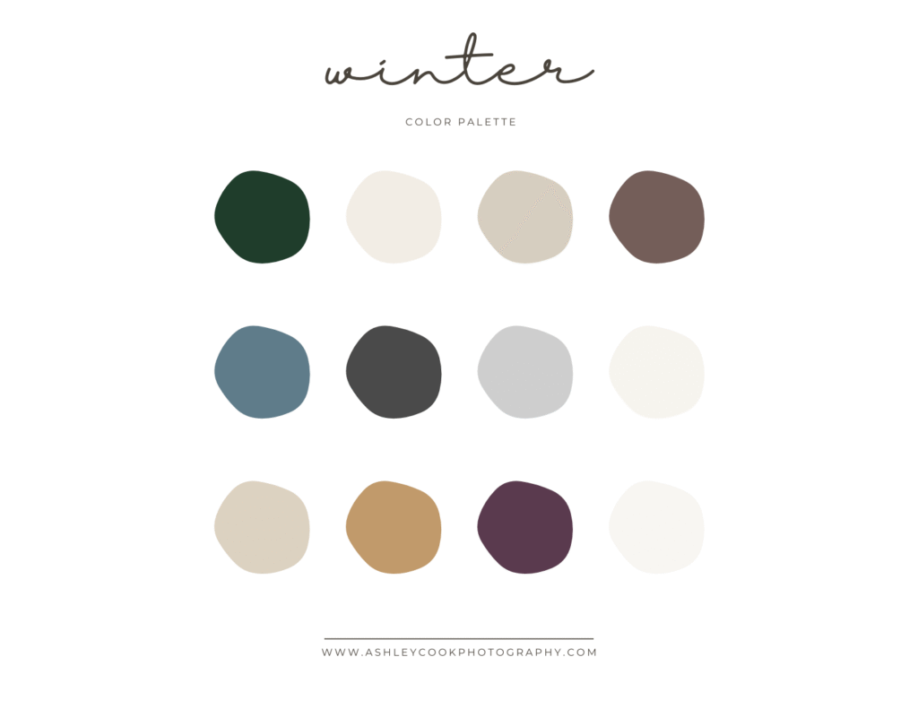
Palette 1: Cream & Evergreen
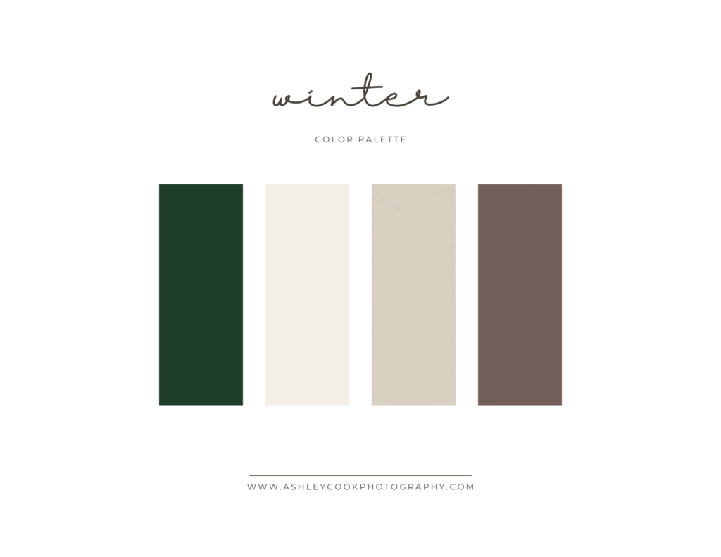
Perfect for tree farm sessions or forest backdrops.
- Evergreen
- Cream
- Warm beige
- Soft brown
Why it works: Evergreen adds depth without overpowering the image, while cream and beige keep everything light and balanced. This winter family photo color palette feels classic and works beautifully for both holiday sessions and non-holiday winter portraits.
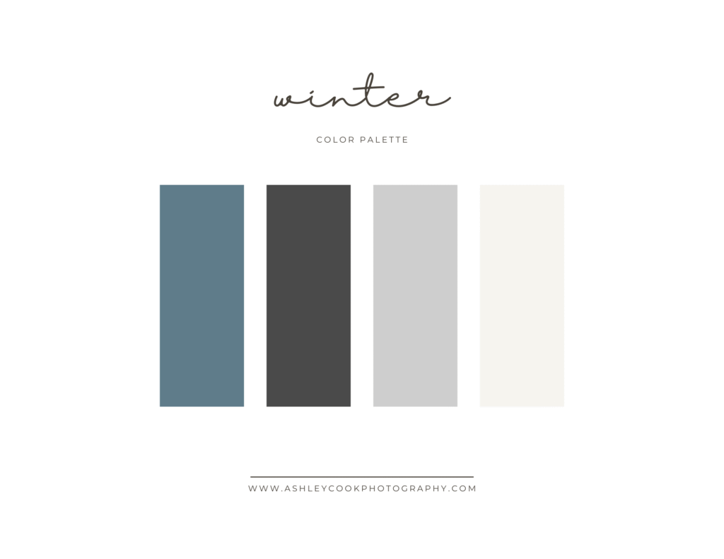
Palette 2: Cool Winter Neutrals
A clean, modern option.
- Steel blue
- Charcoal
- Soft gray
- Ivory
Why it works: These tones mirror Oregon’s cool winter skies while still feeling refined. Ivory prevents the palette from becoming too dark, and steel blue adds subtle interest without feeling bold.
Palette 3: Cozy Neutrals with Depth

Warm and inviting without being overly seasonal.
- Oatmeal
- Camel
- Deep plum
- Soft white
Why it works: Camel and oatmeal bring warmth to cooler days, while deep plum adds richness without leaning into bright red. This winter family photo color scheme feels cozy and elevated rather than festive or theme-based.
What to Avoid for Winter Family Pictures
- Bright holiday red unless you want a very seasonal look
- Heavy black on everyone
- Bulky layers that overwhelm smaller children
- Loud patterns that compete with textured fabrics
Winter is about texture. Knit sweaters, wool coats, structured layers, and soft scarves add depth and dimension in a way that summer fabrics cannot. When styled intentionally, winter family photo outfits can look some of the most polished of the entire year.
How to Coordinate Family Outfits Without Matching
One of the biggest misconceptions about family photo outfits is that everyone needs to match. Coordinated outfits photograph beautifully. Identical outfits often do not.
The goal is balance, not duplication.
Start with one anchor color. This is usually worn by mom or the person whose outfit sets the tone for the session. From there, build around that color using two or three complementary tones from your chosen palette.
Each family member can wear one or two colors from the overall scheme. Not everyone needs to wear every color. When done well, the outfits feel cohesive without looking overly styled.
Here is a simple formula that works every time:
- Choose one anchor color
- Add two supporting tones
- Include one or two neutrals
- Mix textures instead of patterns
Textures such as knits, linen, denim, and soft layers add dimension without overwhelming the photo. If you include patterns, limit them to one person and keep the pattern subtle.
When outfits are coordinated instead of matched, your family photos feel natural, timeless, and elevated.

What Not to Wear for Family Photos
Choosing the right color scheme is important, but knowing what to avoid can make an even bigger difference. Certain outfit choices can distract from your connection and pull attention away from your faces.
Here are a few common mistakes to avoid when planning your family photo outfits.
1. Neon or overly bright colors
High-saturation colors reflect light and can cast unwanted color tones onto skin. Bright reds, neon pinks, and electric blues often overpower natural Oregon landscapes.
2. Large logos and graphic prints
Logos, bold lettering, and busy graphics draw the eye immediately. Your photos should focus on connection, not branding.
3. Everyone in the exact same outfit
Matching white shirts and jeans can feel flat and dated. Coordinated tones with variation in texture create a much more elevated result.
4. Too many competing patterns
If one person wears a subtle pattern, keep the rest of the outfits more neutral. Multiple bold patterns can feel chaotic in photos.
5. Heavy black on everyone
Black can photograph beautifully when styled intentionally, but if everyone is wearing solid black it can feel harsh and remove dimension from the image.
When in doubt, earth tones, layered textures, and thoughtful coordination will always photograph better than bold pieces.
Family Photo Outfit FAQs
What colors look best in family photos?
Honestly, it depends on your family and the overall feel you want your session to have. There is no single “right” answer, and I hope this guide serves as inspiration rather than a strict rulebook.
Soft, earthy tones tend to photograph beautifully in natural light, especially in Oregon’s landscapes. Neutrals paired with one or two complementary colors create depth without overpowering the image. That said, jewel tones can also look stunning and add richness, especially in fall and winter sessions.
Do not be afraid to choose colors that feel authentic to your family. The best family photo color scheme is one that reflects the season, the location of your session, and your personal style.
How do I choose a family photo color scheme?
Start with one anchor color and build around it using two or three supporting tones. Choose colors that complement the season and the natural backdrop. Not everyone needs to wear every color, but everyone should stay within the same overall palette.
You can use the seasonal color palettes in this post as inspiration when planning your outfits. Save the images, or bring them with you while shopping to keep everything cohesive.
If you would like even more ideas, you can also browse my Pinterest board dedicated to family photo color palettes for additional seasonal inspiration and outfit combinations.
Should everyone match in family pictures?
No. Coordinated outfits photograph better than identical ones. Mixing complementary tones, textures, and layers creates visual interest while keeping the overall look cohesive.
What should moms wear for family photos?
Start with mom’s outfit first. Choose something that feels comfortable, flattering, and within your chosen color scheme. Once that is set, build the rest of the family’s outfits around those tones.
Planning Your Family Photos in Eugene
No matter the season, choosing the right family photo color scheme makes a noticeable difference in how your images feel. When outfits are thoughtfully coordinated with the time of year and the surrounding landscape, your photos look cohesive, natural, and timeless.
Whether you are planning spring family pictures at Dorris Ranch, a summer evening session near the coast, fall portraits at Mt. Pisgah, or a cozy winter shoot among the evergreens, the right color palette will help your family stand out beautifully against Oregon’s scenery.
If you are still unsure what to wear for family photos, I always help my families refine their outfit choices before their session. From selecting a color scheme to making small adjustments for balance, you will never be left guessing.
If you are looking for a Eugene family photographer who will guide you through every step of the process, I would love to help you plan a session that feels effortless and true to your family.You can learn more about my family sessions here or reach out to begin planning your next seasonal session.
More Family Photo Planning Resources
If you found this seasonal family photo color guide helpful, you may also love these additional planning resources:
• What to Wear for Spring Family Photos – A deeper dive into styling tips, layering ideas, and outfit inspiration specifically for spring sessions in Oregon.
• The Best Locations for Family Photos in Eugene – A guide to some of my favorite local spots including Dorris Ranch, Mt. Pisgah, and the Oregon coast.
• How to Prepare Young Kids for Family Photos – Practical tips to help sessions feel relaxed and stress-free.
Each of these posts expands on what we covered here and helps you plan a session that feels effortless from start to finish.
If you are planning family photos and want guidance on outfits, location, and seasonal color palettes, I am here to help. You can connect with me through my contact page and we will start designing a session that feels effortless and true to your family.